
CAMPAIGNS
Deep Ellum Brewery
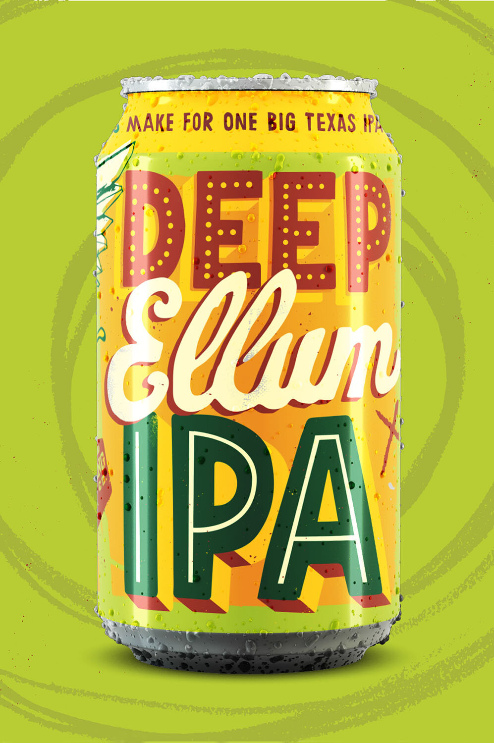
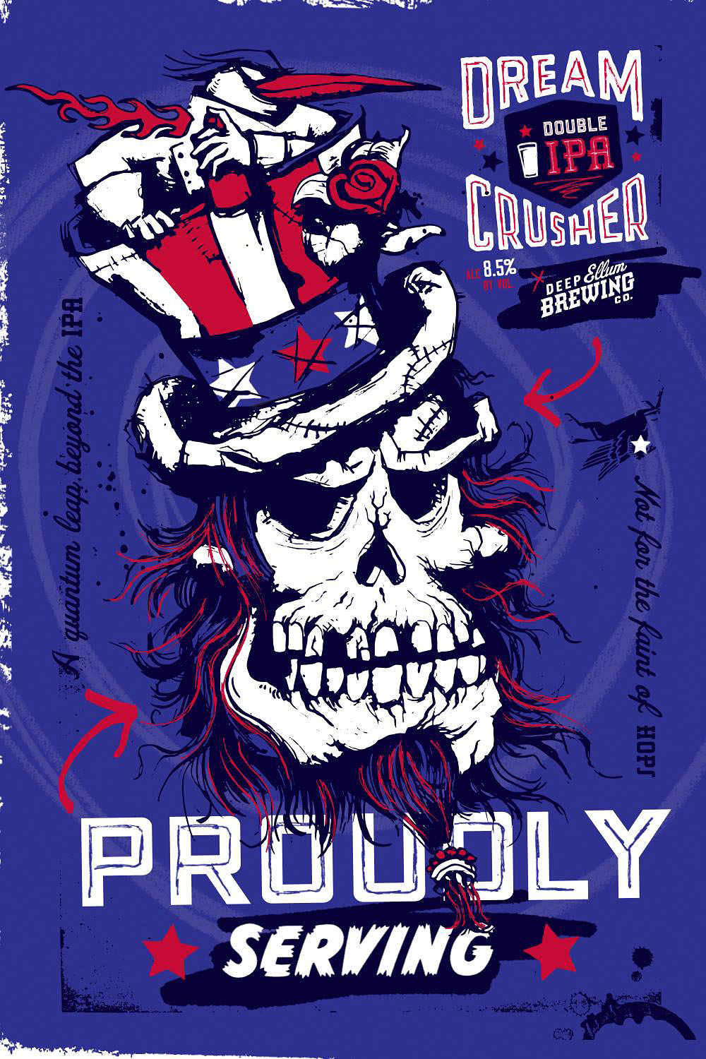
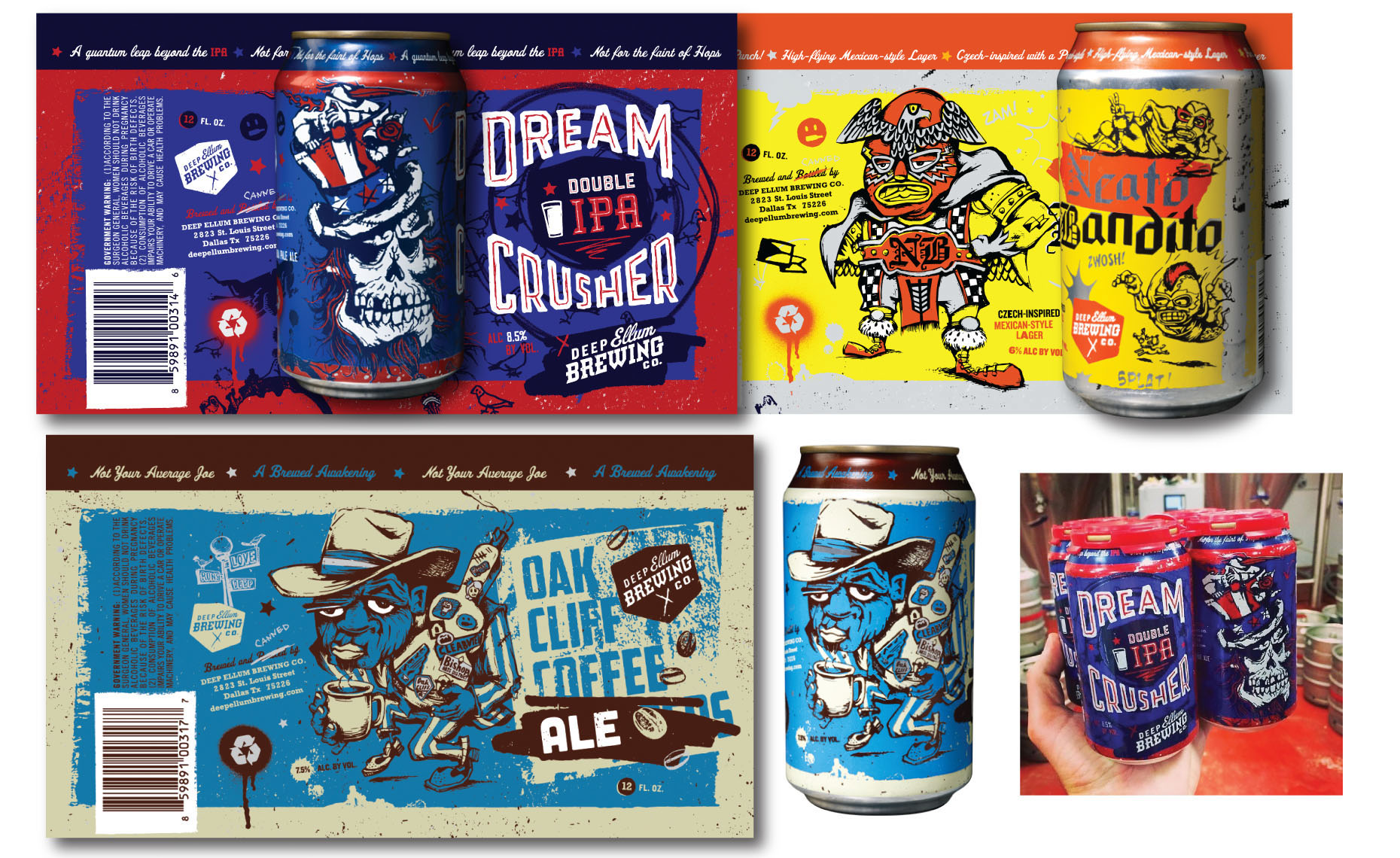
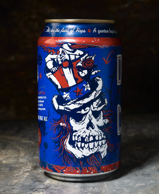
The Deep Ellum neighborhood is a place I know well. Having a studio and living there for several years gave me just the right perspective when asked to help develop the brands of beers coming out of this red-hot craft brewery — specifically the artwork for the cans. The fans of Deep Ellum Brewery are loyal, and each brew needs its equal counterpart brand label. It’s what you identify with the taste, the visual embodiment. From such a mighty task were born characters that imbued the attitude, reflected the craftsmanship and character, and carried with it a visual symbol of its bond with its beer-loving patron. Whether it’s a dark IPA, a platinum-blonde ale, or a Czech-inspired Mexican-born summer lager, each had its own visual character, serving as an iconic and hallmark identity.
“I never realized just how important or big the impact would be when creating characters for the beer cans. The fans/consumers of labels are ferociously brand loyal. Interpreting these beers into visual works of art was the real fun. Seeing the brand loyalty take on a life of its own was, and still is, awesome. The first time I saw a fan had a tattoo of Dream Crusher on his arm … I was dumbfounded and proud.”


Voodoo BBQ
This brand is a naturally quirky one, but in a good way … fast-casual barbecue born off St. Charles street straight out of New Orleans. Cajun meets BBQ. The strategy was to evolve the brand to showcase the rich vibrancy of New Orleans, and remarry the VooDoo namesake into something that would be fun, edgy and irreverent, a little witchy, but still friendly to mass audiences. The appointment was to create a library of icons, type, and vignettes that could seamlessly translate into all aspects of the marketing and in-store collateral. Further development in this direction entailed in-store vision-building 3D sculptures, painted murals, some curated photography, and sign messaging.
“Food is Art. Come get some Mojo. Voodoo is the Art+Soul of BBQ. The messaging said it, which led the entire project.”


Showboat Casino + House of Blues
The campaign of the Showboat Casino in Atlantic City was to introduce the new House of Blues inside the casino. A crossover rebrand and promotion included taking the key House of Blues aesthetic and blending it into a new casino-driven promotion. The campaign included all levels of collateral, including outdoor boards and TV spots.


Frito-Lay
Frito-Lay is America. My work with Chester Cheeto was a childhood dream come true. Anyone who has ever finished lunch with orange fingers tips knows — Cheetos are fun! Taking from that indelible sense memory easily fueled the creation of multiple standees and promotions. I have math skills I never utilized until this project. It was both exhilarating and overwhelming to see these 10-foot standees come to life and every inch of them lined up perfectly.
“Walking into a supermarket and seeing a row of 10 foot holiday nutcrackers, stands that you created, makes you feel like one of Santa’s little helpers bringing holiday cheer to the masses.”


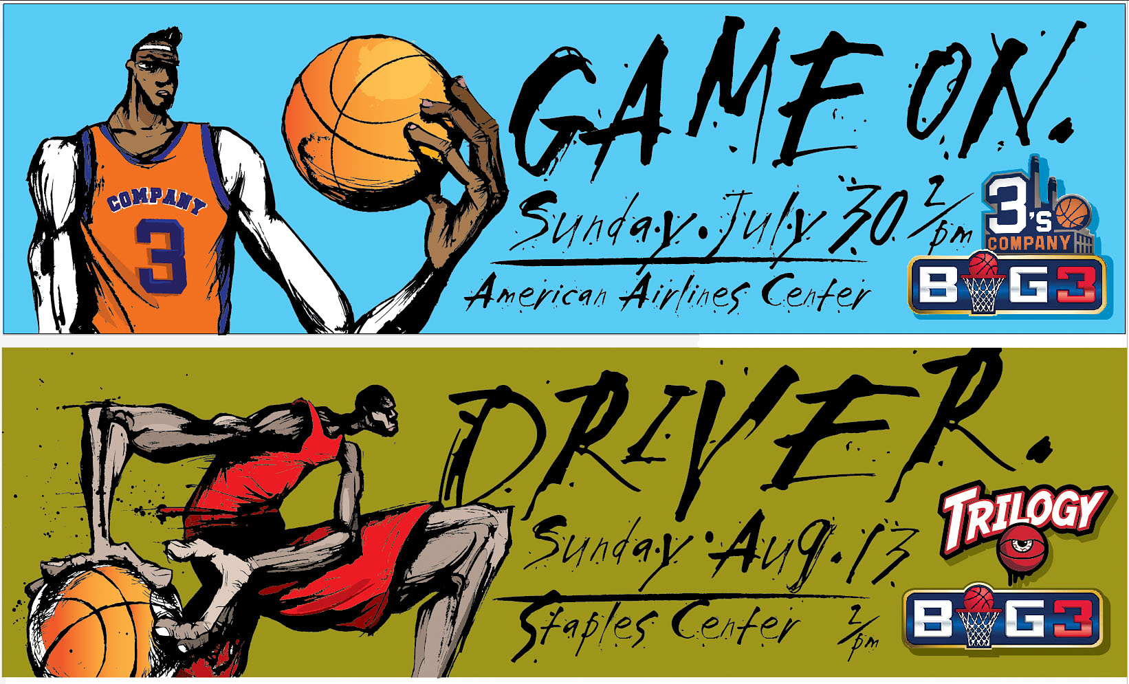
BIG3 Basketball
This is a new professional basketball league formed by owner Ice Cube. I was taken by the fresh new concept of extending a major professional sport beyond its players’ existing professional lifespan. Like golf, in BIG3, there is a “seniors tour” element that is fascinating. All your favorite players fresh out of retirement, competing in a professional-level sport based on the street sport that you grew up playing — half court 3-on-3 ball. It was with this enthusiasm I created promotional concepts. My vision embraced the street art swag of an inner city basketball court and married it with sharp, saturated colors and gestural lines.
“I have always had a fascination with drawing basketball players. I look to their movements as a combination of gladiator combat meets ballet dancer.”


AMP Energy
This was a promotional project for AMP Energy business. A series of AMP concepts was taken from the elemental symbol molecule. The idea took many forms, and exploring each of them as an unrelated but related chain of vignettes, was enticing.


Dibond Paper
It is rare on a project that you get to do everything. But this was a rare project. The Dibond Metal Series was a full package and promotion kit built to showcase a new technology in printing on metal paper. They had me at metal paper … they also had me at pirates. The art director wanted the piece to be done in a treasure chest theme with the inside holding the paper samples as precious metal shillings. The result was full-package design, holding paper samples as Pirate Coins.
“The real buzz-currency of the project was getting into deep historical pirate research, and drawing out these characters from the stories of folklore.”


